Have you ever walked into a room and immediately felt a wave of calm? Or stepped into another space and felt your energy spike, your mind buzz with ideas? It wasn’t an accident. It was color.
We’ve been sold a lie about paint. We’ve been told it’s just decoration—a cosmetic layer to make things “pretty.” We choose colors based on trends, square footage, or what looks good in the store’s fluorescent lighting. We’re treating color like wallpaper, when it’s actually weather.
Color is environmental energy. It’s light made emotional. It doesn’t just sit on your walls; it radiates, it influences your nervous system, it alters your perception of time and space. The right color can be a sanctuary. The wrong one can be a source of low-grade, daily anxiety you can’t quite pinpoint.
This isn’t just art theory. It’s chromotherapy—the use of color to promote physical, emotional, and mental well-being. And your home is the most powerful clinic you have. Let’s stop decorating and start prescribing. Let’s use paint and palettes not to follow trends, but to engineer how you want to feel in every corner of your life.
Part 1: The Science of Feeling Blue (And Green, And Yellow)
Before we pick up a paint swatch, let’s understand the mechanism. How does a wavelength of light hitting your retina change your heart rate?
It’s Biological, Not Just Psychological
Color perception starts in the eye, but its effects ripple through the hypothalamus—the part of your brain that acts as a control center for hormones, body temperature, hunger, and sleep cycles. Different colors can trigger the release of different neurochemicals.
- Cool Blues & Greens: Can signal safety and calm to the primal brain, potentially lowering cortisol (the stress hormone) and slowing the heart rate.
- Warm Reds & Oranges: Can stimulate the senses, increase appetite, and promote conversation by subtly raising energy levels.
- Soft Neutrals & Earth Tones: Can ground the nervous system, providing a sense of stability and reducing sensory overload.
The Weight and Temperature of Color
Colors also have perceived “visual weight” and “temperature.”
- Dark, saturated colors (navy, charcoal, forest green) feel heavy, anchoring, and intimate. They advance toward you, making large rooms feel cozier.
- Light, desaturated colors (sky blue, pale pink, oat) feel light, airy, and expansive. They recede, making small rooms feel larger.
- Warm colors (reds, oranges, yellows, warm whites) feel stimulating, cozy, and inviting.
- Cool colors (blues, greens, purples, cool greys) feel calming, serene, and spacious.
Understanding this is your first superpower: you can literally paint to make a room feel larger, cozier, warmer, or cooler.
Part 2: The Emotional Prescription – A Room-by-Room Guide
Your home serves different functions. Your color palette should be your ally in each one.
The Bedroom: The Sanctuary of Rest & Restoration
Goal: Lower cortisol, promote melatonin, induce calm.
- The Champions: Soft, muted blues (like a hazy sky), gentle sage greens (like eucalyptus), lavender-greys, warm, very pale pinks (think “quiet sunset”). These are the most scientifically backed colors for sleep support.
- Avoid: Vibrant reds, oranges, or bright yellows. They are stimulating. Also avoid pure, stark white, which can feel clinical and create harsh light reflections.
- Pro Tip: Go dark and cocooning if you dare. A deep navy or charcoal can be incredibly restful, making the outside world disappear and your bed feel like a safe haven. Pair with warm wood tones and soft, textured bedding.
The Home Office / Study: The Zone of Focus & Flow
Goal: Promote concentration, minimize distraction, sustain energy.
- The Champions: Deep greens (like forest or hunter green) are associated with balance, growth, and endurance. Soft, warm greys with a hint of brown (greige) provide a neutral, sophisticated backdrop that doesn’t fight for attention. Muted blues can also aid clear thinking.
- Avoid: Overly bright or energizing colors (like fiery orange) that can lead to agitation over long periods. Also avoid boring beige that can sap motivation.
- Pro Tip: Use an accent wall in a richer, more stimulating color (a deep teal, a burnt orange) behind your desk to define the “work zone” and provide visual inspiration, while keeping other walls calmer.
The Kitchen & Dining Room: The Hearth of Nourishment & Connection
Goal: Stimulate appetite, encourage conversation, foster warmth.
- The Champions: Warm terra cottas, ochres, and muted reds (think tomato soup or clay pot). Happy, soft yellows (like butter or beeswax). Earth-toned greens (like olive or avocado). These colors are inherently welcoming and linked to food and earth.
- Avoid: Cool blues and greys, which can suppress appetite (how appetizing does food look under fluorescent blue light?).
- Pro Tip: If you love a cool palette, add warmth through materials: wood cabinets, brass hardware, woven baskets. Color on walls isn’t your only tool.
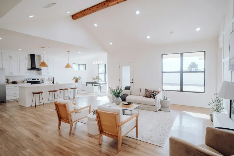
The Living Room: The Hub of Relaxation & Socializing
Goal: Foster relaxation and connection. A balanced, flexible mood.
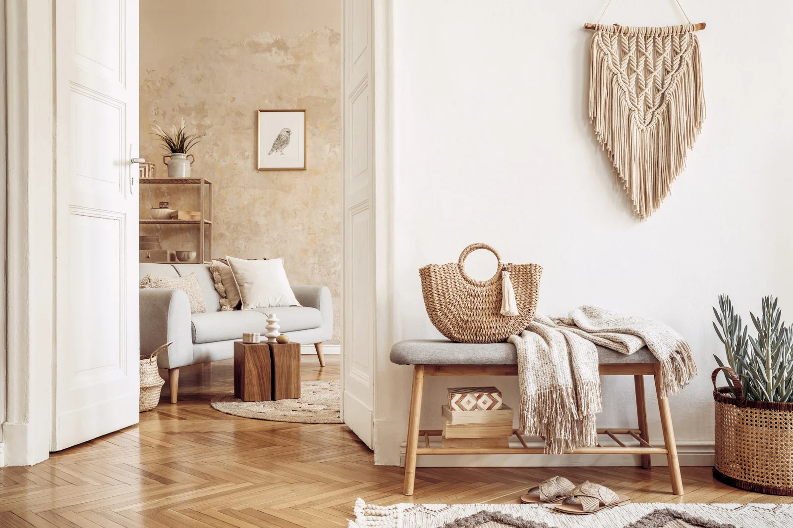
- The Champions: This is the room for earthy, complex neutrals. Think: Warm whites (with yellow/red undertones, not blue), greiges, taupes, and putty colors. These create a serene, adaptable backdrop that makes art, textiles, and people pop. Muted greens (sage, celadon) also bring a peaceful, natural vibe.
- Avoid: Anything too intense or personally polarizing as a main wall color. This is a shared space.
- Pro Tip: Inject personality and mood through changeable elements: colored sofa cushions, vibrant art, a statement rug. The walls provide the calm stage; your decor provides the play.
The Bathroom: The Spa for Renewal
Goal: Create a clean, serene, rejuvenating atmosphere.
- The Champions: Spa-like blues and greens (seafoam, pale aqua). Clean, warm whites. Soft, mineral-inspired greys. These feel hygienic, tranquil, and connected to water.
- Avoid: Bold, dramatic colors that can feel overwhelming in a small, reflective space.
- Pro Tip: For a truly luxurious feel, consider a monochromatic scheme: all walls, trim, and cabinetry in the same soft, warm white. It feels expansive, clean, and incredibly peaceful.
Part 3: Beyond the Walls – The 60-30-10 Rule for Holistic Harmony
Walls are just the beginning. To truly craft a mood, you need a holistic color strategy. Use the classic 60-30-10 rule as your guide:
- 60% Dominant Color: Your walls, large area rugs, maybe a sofa. This sets the core mood.
- 30% Secondary Color: Upholstery, curtains, accent chairs. This provides visual interest and support.
- 10% Accent Color: Throw pillows, art, vases, small decor. This is where you inject energy, personality, and vibrancy.
Example: A calm bedroom could be 60% hazy blue walls, 30% neutral linen bedding/curtains, and 10% accent in a soft terracotta or deep moss green.
Part 4: The Practical Magic – How to Test & Choose Without Fear
This is where people panic. The paint chip lies! Here’s how to win.
- Forget the Chip. Get a Sample. Always, always, always paint a large (at least 2’x2’) swatch directly on your wall. Paint two coats on white poster board and tape it up. Live with it for 2-3 days. See it in morning light, afternoon light, and artificial night light. The color will transform.
- Mind the Undertone. This is the secret language of color. Is that grey cool (blue/purple undertone) or warm (green/brown undertone)? Is that white bright (blue) or creamy (yellow/red)? Hold swatches together. The undertone will become obvious in comparison.
- Consider LRV (Light Reflectance Value). Found on the back of paint chips, this number (0-100) tells you how much light a color reflects. A 50+ LRV is light and airy. Below 30 is dark and absorbing. For a dark room, choose a color with a higher LRV to help bounce light.
- Start with an Inspiration Anchor. Don’t start with a blank wall. Start with a piece of art, a rug, or a fabric you love that has a color story you respond to emotionally. Pull your palette from there.
Conclusion: Your Home as a Healing Palette
Choosing color for your home is one of the most powerful, affordable acts of self-care you can undertake. It’s not a frivolous design decision; it’s an environmental prescription.
You are the architect of your own daily experience. Do you need a bedroom that hushes the noise of the world? Paint it a whispered blue. Do you need a kitchen that wakes up your senses and gathers your people? Wrap it in warm, nourishing earth tones. Do you need a corner for deep work? Envelop it in a focused, resilient green.
Stop asking, “What color is in style?” Start asking, “How do I want to feel in this room?” Then, wield your brush with intention. Paint your peace. Paint your energy. Paint your joy. Your walls are waiting to heal you.
FAQs: Your Color Therapy Questions
Q1: I love bright, bold colors. Does color therapy mean my home should be all muted and calm?
A: Absolutely not! Color therapy is about intentionality, not restriction. If a vibrant fuchsia or a sunshine yellow makes your heart sing and energizes you, that is its therapeutic value for you. The key is placement. A bright, stimulating color might be perfect for a creative studio, an exercise room, or an accent wall in your living room. It’s about matching the color’s energy to the room’s purpose and your personal response.
Q2: My house doesn’t get much natural light. What colors will make it feel brighter?
A: This is where LRV is your best friend. Choose paints with a Light Reflectance Value of 60 or higher. Opt for warm whites and very pale, warm versions of colors (soft peach, buttery yellow, light greige). Warm undertones will counteract the cool, grey cast of low light. Avoid dark colors and cool, stark whites, which can feel dingy. Mirrors and strategic lighting are non-negotiable partners to your paint choice here.
Q3: I’m afraid of color commitment. What’s a safe but impactful alternative to painting the whole room?
A: Start small and contained.
- Paint the ceiling: A soft sky blue or pink can be magical and feels less committing than walls.
- Paint interior doors or built-in shelving a rich, contrasting color.
- Paint just the wall behind your bed or sofa (an accent wall).
- Use color in non-paint forms first: A massive, colorful rug. Floor-to-ceiling curtains in a bold pattern. A large piece of art. These can give you the color impact without a drop of paint, and are easier to change.
Q4: How do I coordinate colors between rooms that flow into each other (open floor plan)?
A: The goal is harmony, not matchy-matchy. Choose a cohesive palette of 3-5 colors that work together (e.g., a warm white, a greige, a sage green, a navy, a terracotta). Use your 60% dominant color (likely the warm white or greige) on most walls throughout for flow. Then, use your secondary and accent colors differently in each “zone.” The kitchen island might be navy, the living room accent chairs might be sage, and your decor pillows might be terracotta. The shared palette creates connection; the varied application defines spaces.
Q5: Can the wrong color really make me feel anxious or depressed?
A: It can contribute to those feelings, yes. If you’re already prone to low mood, a dark, poorly lit room with cool, gloomy colors can reinforce that state. A room that’s visually chaotic with too many clashing, bright colors can subconsciously overstimulate your nervous system, creating low-grade anxiety. Our environments cue our brains. If your space constantly cues “chaos,” “gloom,” or “agitation,” it takes a mental toll. The flip side is the incredible opportunity: a supportive space can actively cue “calm,” “focus,” or “joy,” becoming a tool for well-being.